Article
Restaurant design: Fast-casual look attracts customers
Donatos and Panera add to their brand with an attractive exterior design.
August 28, 2006
 ChatGPT
 Grok
Grok Perplexity
 Claude
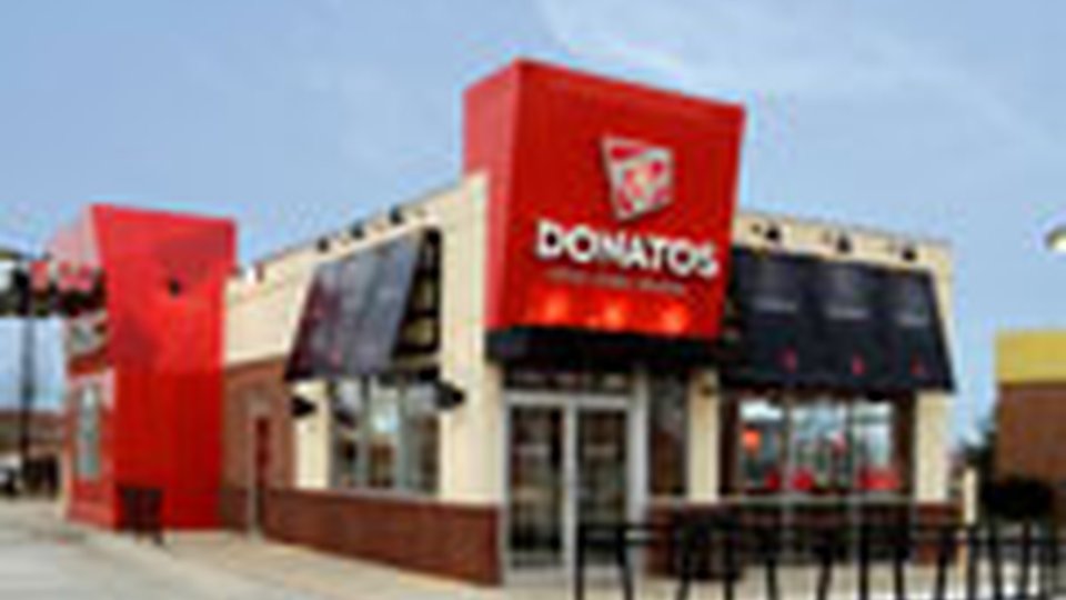
When Donatos Pizza commissioned Design Forum to create a new look for its restaurants, it gave the architects more direction on what not to do than what to do.
The bulk of the 179-unit Columbus, Ohio, fast-casual pizza chain's stores are delivery-carryout only, while about 25 percent offer seating. Of those dine-in spots, about 40 were designs developed but ultimately abandoned during McDonald's ownership of the chain from 1999 to 2003. The units were expensive to
build and their exteriors "over-promised on what to expect from inside because the majority of Donato's business is delivery," said Bill Childley, Design Forum chief creative officer.
|


Donatos also told Design Forum its pizza customers' preferences were changing: some wanted delivery some of the time, while on other days they wanted a dine-in experience. Others wanted drive-thru, a tool Donatos picked up when owned by McDonald's.
In many ways, Donatos wanted to have it all in its new design and, in essence, it said, "We're still about pizza, but we don't want to look like a pizza company."
Chidley knew exactly what its officials meant: Donatos wanted a fast-casual look, a mold-breaking design that would attract customers seeking a high-quality pizza and an extraordinary service experience, not just another pie in a box. A traditional pizzeria wouldn't work because "customers see it as it as yet another pizza place," Chidley said. "We wanted it to look totally different from the rest of the category. We wanted it to stand out and make a statement."
In fast casual, that statement often runs contrary to established norms for different food categories. Andrew Hubbard, senior design creator for Design Forum, pointed to Chipotle Mexican Grill as a prominent and successful trend bucker.
"It's using rusted metals, metal highlighting and detailing that a lot of casual restaurants would deem too industrial," said Hubbard, whose company is headquartered in Dayton, Ohio. Chipotle's designs look neither like those found in quick-service or full-service restaurants. They don't even look Mexican. The beauty of designing fast-casual restaurants is in the category's newness. It allows designers to write the rules as they go — or write none at all, Hubbard said. "Chipotle has done a great job of differentiating itself from the norm. Other fast casual concepts are doing the same."
-- Grady Cooley Designer |
Outside in
Though fast-casual restaurant designers may have a good deal of freedom to break new ground, their ideas must communicate one clear message: This restaurant is fast casual, not quick service or casual dining. As Chidley said, just because "there's not a codified, canonized bag of design tricks," the restaurant's exterior still must project an image of speed of service and a higher caliber of food. "It's an art to balance those two extremes."
Hubbard said most fast-casual designs are reinterpretations of commonly seen themes. For example, casual-dining restaurants typically incorporate awnings that are minimally adorned monochrome panels stretched horizontally along a restaurant's sides.
By contrast, Hubbard pointed to Panera Bread, whose awnings are striped with brighter colors and cut in single panels stretched vertically over individual windows. The design change isn't radical, but passersby recognize a difference subconsciously. The nuance makes them ask themselves, "What's going on here?" he said.
In abandoning its old identity and adopting a fast-casual look, Donatos simultaneously ignored and adopted some fast-casual themes. Like Panera, its awnings are individual and vertical, but they're black and stand out sharply against the building's ivory color. The fascia above the drive-thru window and the front entry are bright red (a primary color more commonly used in quick-service restaurants), but block lettering lends a sophisticated air.
Pat Walls, chief development and administrative officer for McAlister's Deli, said the 201-unit chain sought similarly distinguished twists in its newly redesigned exterior, rolled out in July at a Ridgeland, Miss., corporate store. The new look includes checkerboard awnings, window shutters, antique lamps mounted above the awnings, plus a half-height curtain on the inside of the windows. The aim, Walls said, was to increase the already homey feel — read "non-New York deli" — of a McAlister's by softening the exterior. "We want people to think to themselves, 'I'd like to stay here awhile. This is very comfortable.'"
Fast-casual exterior colors are often muted, Chidley added, because they speak of informality while hinting that this isn't the place to get rapid service. By contrast, QSRs bear bright color schemes easily recognized from a distance. Darker tones hint at a higher-level experience found at casual and fine-dining spots.
Because fast-casual concepts occupy a mix of freestanding and inline spaces, exterior lighting varies widely.
Lighting is commonly mounted above awnings to showcase brand logos on awnings. In the case of McAlister's, lights highlight offerings such as soups and sandwiches spelled out on the building's exterior.
Interior lighting also helps a fast casual's exterior appeal by giving customers a good look at the inside from the outside. The aim is to keep the outside lighting subdued so it doesn't compete with inside lighting.
Give me a sign
Where QSRs tend to rely heavily on multiple signs — mounted at street level in landscaping, on rooftops and on high roadside poles — fast casuals are working to figure out how to create a similar level of visibility without looking cheap, Chidley said.
Tim Murphy, Design Forum's sales and marketing vice president, said fast casuals face the additional challenge of being located in upscale areas that commonly have tight rules on signage.
"Their challenge is to maintain a premium image while still standing out," he said. "You see a lot of backlit signs mounted directly on the building," incorporating the company's logo. Backlit lettering is common, too, but color choice becomes crucial again. Backlit red and green lettering is easy to see at night, but they might not make the quality statement a fast-casual operator wants.
 Finding the right sized sign is a challenge, too, said designer Grady Cooley.
"I've seen where they just put the name of the place along the skirt of the awning; it's very subtle but effective. But sometimes it's too small, and people are saying, 'What's the name of that place?'" said Cooley, owner of Grady Cooley Interiors in New York. "Other places I've seen signage that is huge, in your face. It's unmistakable who they are, and yet it's done in very tasteful and artistic way."
Walls said McAlister's new sign accomplished the difficult challenge of being highly visible both at day and at night.
"We used white letters against a green background so the name really pops in daytime," he said. Before the change, the sign was neon. "At night, the letters are backlit so it's still very visible."
Fast impressions
All three Design Forum officials said fast-casual operators have their work cut out for them if they want to have the roadside recognition commanded by QSRs. Plus, by virtue of the segment's current evolution, definitive exterior design cues likely won't firm up soon. The rules are being written now, they say, and that makes their jobs fun. Regardless, the goal remains the same, Murphy said.
"When you talk about exteriors, you've got to communicate from the street level what the proposition is, what customers are going to get from you when they come inside," he said. "If it's fast casual, you need to let them know (through your exterior) that they should anticipate a fresher prepared meal and a higher level of service."
Related Media
Subscribe
Get the latest news and resources from Fast Casual.